Dura Supreme Cabinet Finishes: A Guide to Woods, Stains & Paints
A cabinet finish is never just a color.
It determines how much grain remains visible. How light moves across the cabinetry. Whether the room feels warm or crisp. How strongly the cabinetry contrasts with stone. How it relates to flooring. And whether the cabinet fronts become a dominant material in the architecture or quietly support everything around them.
With Dura Supreme, designers have a substantial finish vocabulary to work with.
The current collection includes stained natural woods such as Cherry, Hickory, Knotty Alder, Maple, Quarter-Sawn White Oak, and Red Oak, along with painted cabinetry, custom paint capabilities, glazes, cerused finishes, veneers, and contemporary surface materials.
That breadth creates flexibility.
But it also makes editing important.
A designer does not need to find the most interesting finish in the collection.
They need to find the finish that makes sense for the architecture, the light, the surrounding materials, and the role the cabinetry is supposed to play.
Where Should Designers Start When Choosing a Dura Supreme Finish?
Not with color.
Start with material.
Ask whether the cabinetry should feel like:
Natural wood
Stained wood
Painted cabinetry
A combination of wood and paint
Once that decision is clearer, the finish conversation becomes much more focused.
A warm contemporary kitchen might depend on visible wood grain. A transitional interior might need painted cabinetry with a natural-wood island. A home office might benefit from a deeper wood tone. A laundry room may work better with a quiet painted finish.
The finish should follow the design strategy.
Why Is the Wood Species as Important as the Stain?
Because stain does not erase the wood underneath it.
It interacts with it.
The same general stain direction can look very different depending on:
Grain
Natural color
Density
Figure
Porosity
Variation
For example, Dura Supreme notes that Maple can absorb darker stains unevenly because of variations in density, producing a more mottled appearance. Its smooth, fine grain also makes it well suited to both painted and stained applications.
The designer is therefore specifying a combination.
Wood plus finish.
Not simply a finish name.
What Wood Species Does Dura Supreme Currently Offer for Stained Cabinetry?
Dura Supreme’s current finish library lists stained options across:
Cherry
Hickory and Rustic Hickory
Knotty Alder
Maple
Quarter-Sawn White Oak
Red Oak
Each creates a different material expression.
That means the first question should not be:
Which brown do we like?
It should be:
Which wood character belongs in this project?
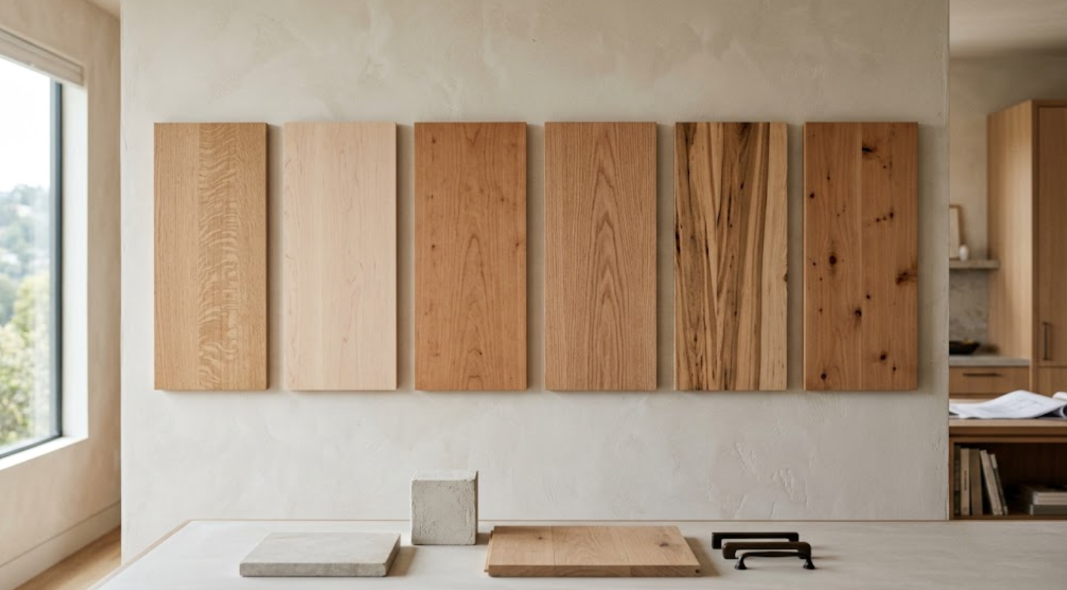
Why Is Quarter-Sawn White Oak So Useful for Contemporary Interiors?
Because the grain tends to feel more controlled.
Dura Supreme currently offers Quarter-Sawn White Oak with a broad range of stained finishes, including:
Natural
Coriander
Sesame
Desert Sand
Cashew
Whiskey Barrel
Toast
Morel
Mission
Pebble
Onyx
That creates a considerable tonal range.
The wood can remain light and quiet. It can become warmer. It can move toward medium brown. Or it can become significantly darker.
For contemporary and transitional interiors, the relatively disciplined grain can work well with simple door profiles where the material itself becomes part of the visual detail.
Should White Oak Always Be Kept Light?
No.
Light white oak has become familiar in contemporary residential design.
But that does not mean it is the only useful direction.
A deeper stain can give white oak more visual weight.
That can work particularly well in:
Libraries
Home offices
Bars
Large kitchens
Media spaces
The choice should depend on the architecture and surrounding palette rather than a general trend toward lighter woods.
What About Cerused White Oak?
Dura Supreme currently offers several cerused finishes on Quarter-Sawn White Oak.
Its process applies a contrasting pigmented material into the open grain after the stain is applied and sealed, making the grain texture more visible. Dura Supreme describes the application as an artistic, hand-detailed technique that naturally produces subtle variation.
That creates a different effect from simply staining the wood.
The grain becomes more pronounced.
For designers, this can be useful when the cabinetry needs more texture without introducing another door profile or decorative element.
When Should a Designer Consider Cerusing?
When the grain itself should become part of the design.
It can work well on:
Feature cabinetry
Islands
Bars
Vanities
Home offices
Selected whole-home built-ins
But it is visually more active than a quiet natural finish.
That should be considered across a large elevation.
A finish that looks subtle on one sample can become much stronger when repeated across an entire kitchen.
What About Cherry?
Cherry naturally brings more color into the cabinetry.
Dura Supreme currently offers Cherry in a range of stains, from relatively natural directions through deeper tones.
For designers, Cherry can be useful when the project needs richer warmth and a more traditional or furniture-like material presence.
But it should be evaluated carefully against:
Flooring
Stone
Other woods
Natural light
Warm metal finishes
If several warm materials are competing, the room can become visually heavy.
A quieter stone or wall finish may give richer wood cabinetry more space.
What About Maple?
Maple has a finer, smoother grain.
That makes it visually different from more pronounced species such as oak.
Dura Supreme currently offers Maple in finishes ranging from lighter Alabaster and Natural through warmer and darker stains such as:
Butternut
Whiskey Barrel
Toast
Clove
Poppy Seed
Java
Onyx
Because Maple can absorb stain differently across areas of varying density, darker stains can emphasize natural variation.
That characteristic should be understood before approval.
A physical sample is more informative than an online swatch.
How Should Designers Approach Hickory and Knotty Alder?
With an understanding that character is part of the material.
When a wood contains stronger grain movement, knots, or tonal variation, the finished cabinetry will naturally become more expressive.
That may be exactly what the architecture needs.
Or it may compete with a very quiet interior.
Material character should be intentional.
Do not select a highly variable wood and then expect every finished cabinet front to behave like the most uniform sample.
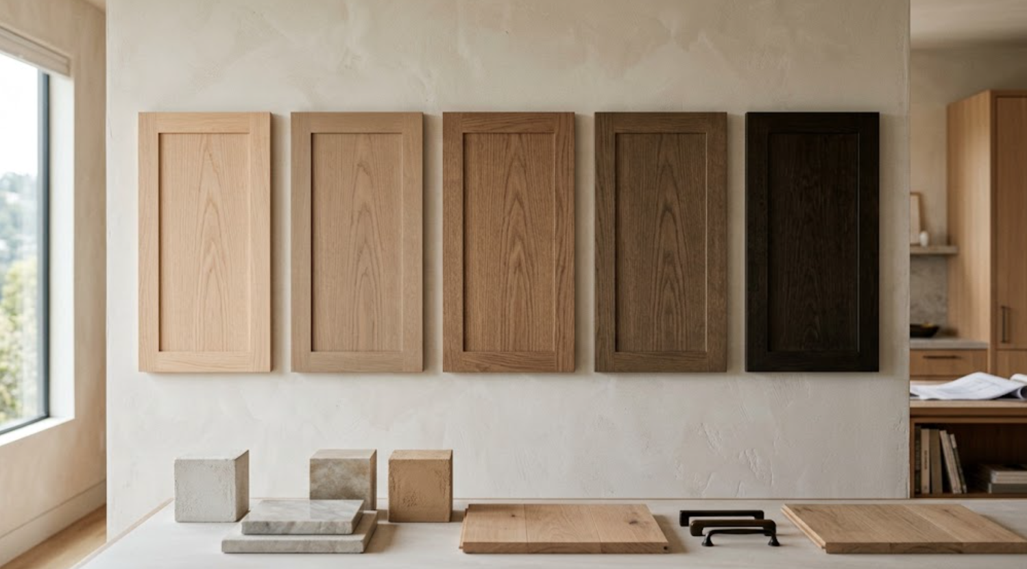
What Does a Stain Actually Do to Cabinetry?
It changes color while preserving visible characteristics of the wood.
That is fundamentally different from opaque paint.
With stain, the designer is working with:
The natural base color
Grain
Figure
Variation
The stain tone
The way those elements interact
That is why two stained doors in the same named finish may not appear perfectly identical.
Natural wood remains a natural material.
How Should Designers Compare Stain Undertones?
Against the actual project materials.
A stain may appear:
Warm
Cool
Golden
Red
Gray
Brown
Neutral
But those qualities are relative.
A seemingly neutral wood may look warmer beside a cool gray stone. A warm brown may become quieter beside limestone. A slightly gray stain may feel cooler when placed next to warm plaster.
The surrounding palette changes perception.
Why Are Newer Brown Stains Worth Considering?
Because brown does not automatically mean traditional.
Dura Supreme currently highlights Desert Sand and Whiskey Barrel as softer, neutral, true-brown stain directions intended to feel warm while remaining contemporary.
That type of brown can be useful when a designer wants more depth than pale natural oak without moving toward highly red, orange, or heavily gray wood.
It can create warmth without making the cabinetry feel visually dated.
Should Designers Mix Two Stained Woods?
They can.
But the relationship needs hierarchy.
Perhaps the kitchen is Quarter-Sawn White Oak and the bar is Walnut. Or the main cabinetry is light oak while the island uses a deeper wood.
The two woods should not look like unsuccessful attempts to match.
Contrast is often easier to understand than near-matching.
If two woods are being used, give each one a role.
What Walnut Options Are Available?
Dura Supreme currently lists Walnut among its exotic veneer options, with finishes including Toast, Morel, and Hazelnut in the current finish library.
Walnut can bring deeper natural warmth into a project.
It can work particularly well for:
Feature islands
Bars
Home offices
Media cabinetry
Furniture-like built-ins
Used selectively, it can create hierarchy within a broader cabinetry palette.
When Should Paint Be Chosen Instead of Stain?
When color should be more important than grain.
Paint creates a more opaque surface.
That can make cabinetry feel:
Quieter
More architectural
More graphic
More closely connected to wall finishes
More expressive through color
Dura Supreme’s current painted palette includes whites, warm neutrals, grays, black, and a Curated Color Collection of deeper contemporary hues.
Paint can therefore play several very different roles.
What Are Some of Dura Supreme’s Current Painted Colors?
The standard current finish library includes options such as:
White
Dove
Classic White
Linen White
Putty
Canvas
Pearl
Silver Mist
Mushroom
Zinc
Storm Gray
Graphite
Black
Its 2026 Curated Color Collection currently includes Sherwin-Williams colors:
Gale Force
Cyberspace
Software
Cast Iron
Evergreen Fog
Rock Bottom
That creates a palette extending well beyond conventional white cabinetry.
How Should Designers Choose Between White and Warm Neutral Cabinetry?
By comparing the cabinet against the architecture.
A bright white may work beautifully in one project.
In another, it may look too sharp beside:
Cream stone
Warm plaster
Natural oak flooring
Bronze hardware
A warmer neutral such as Putty, Canvas, Pearl, or Mushroom may create a more integrated relationship.
The name of the color is less important than the undertone.
Should Cabinetry Match the Wall Color?
Not necessarily.
Even when the same general color family is used, slight separation can create more depth.
The cabinetry may be:
Slightly darker
Slightly warmer
Slightly grayer
The wall may remain softer.
This creates a layered neutral interior without requiring dramatic contrast.
Exact matching can work too.
But it should be evaluated physically because different substrates and finish systems can change how the same nominal color appears.
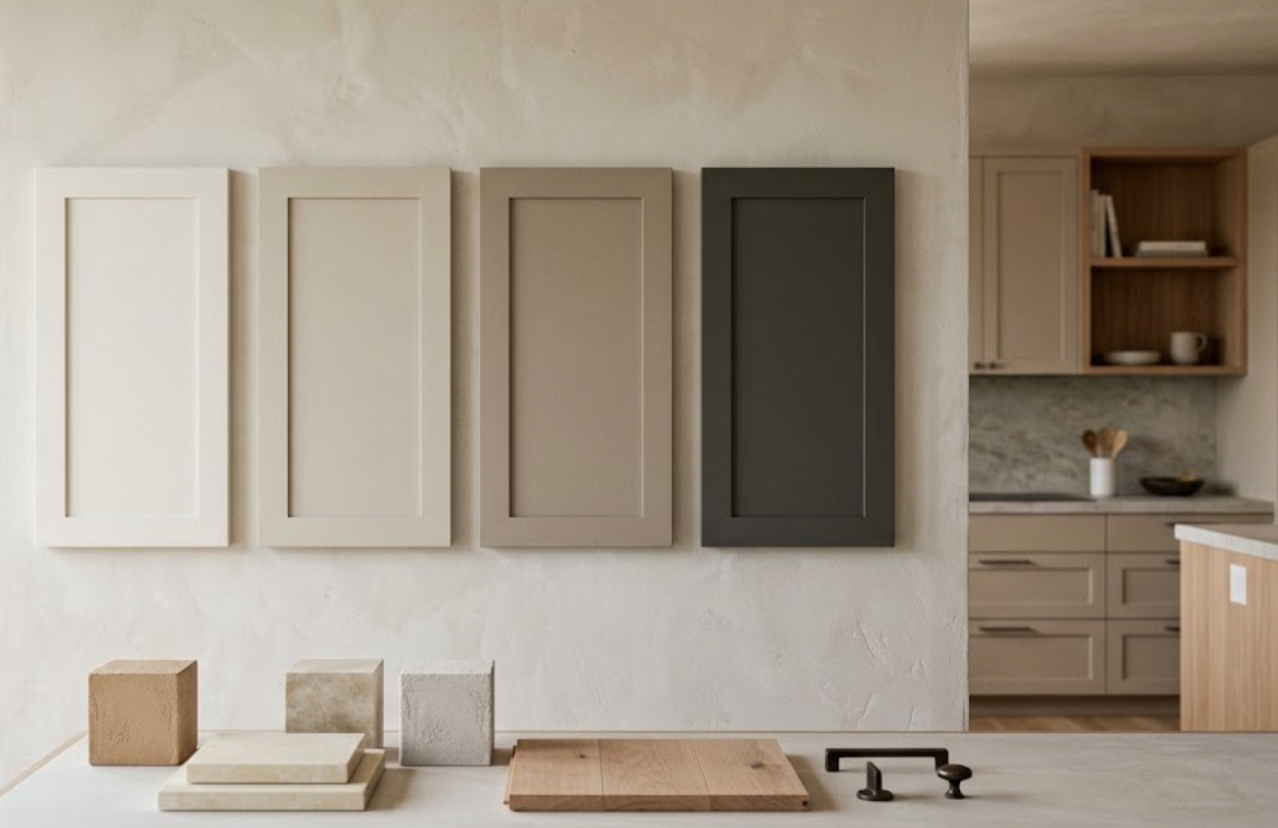
What Is Dura Supreme’s Personal Paint Match Program?
It expands the painted cabinetry palette significantly.
Dura Supreme currently states that its Personal Paint Match Program provides access to the Sherwin-Williams and Benjamin Moore paint palettes, representing more than 5,000 color options.
For designers, that can be useful when cabinetry needs to coordinate closely with an established interior palette.
But more possibilities do not necessarily mean the specification should become more complicated.
Custom color is most useful when there is a clear reason for it.
How Is the Custom Finish Program Different?
Dura Supreme also offers a Custom Finish Program for finishes that extend beyond its standard palette.
The company describes a process in which a paint swatch or physical finish reference can be submitted, a custom sample is developed, and a finished half-door is provided for approval while the corresponding reference is retained for the order.
This can be useful when cabinetry needs to coordinate with:
Existing millwork
Furniture
A specific architectural finish
A highly particular design palette
The approved physical sample becomes especially important in that process.
Does Custom Paint Guarantee an Exact Visual Match to the Wall?
Designers should be careful with that expectation.
Cabinetry and walls are different surfaces.
The substrate differs. The coating system differs. The sheen may differ. The way light reflects from the surfaces differs.
Even when colors are closely coordinated, the finished cabinetry may not visually disappear into the wall.
Often that slight distinction is desirable.
The goal may be harmony rather than literal invisibility.
What Should Designers Know About Painted Wood Movement?
Wood moves with changes in temperature and humidity.
Dura Supreme notes that with painted finishes on wood, microscopic seasonal movement can make seams or small fractures at joints more visible than they would be under stained finishes.
That is a material characteristic worth explaining to clients.
Especially when the expectation is an uninterrupted opaque painted surface.
What Is Dura Supreme’s Paintable Material?
Dura Supreme also offers a premium-grade HDF option specifically intended for painted cabinetry.
The company describes its Paintable HDF as an engineered material designed for a smooth, dense painted surface with minimal expansion and contraction compared with natural wood.
For designers, that creates another decision.
Does the project need visible natural wood character beneath paint?
Or is the objective a smoother, more uniform painted surface?
The answer can influence substrate selection.
What About Painted Oak?
Paint does not always need to hide texture.
Dura Supreme offers painted Red Oak, allowing the wood grain to remain visible through the painted surface.
That creates a different effect from smooth painted HDF.
The color may be opaque.
But the surface still has material character.
This can work particularly well when the design needs:
Color
Texture
Subtle grain
Without the appearance of conventional stained wood.
When Is Painted Oak More Interesting Than Smooth Paint?
When texture matters.
A completely smooth painted door can create a clean architectural plane.
Painted oak creates another layer.
The grain catches light.
The surface becomes more tactile.
That can work well in:
Islands
Bars
Vanities
Selected tall cabinetry
Home offices
It can also provide contrast against smoother painted cabinetry elsewhere in the room.
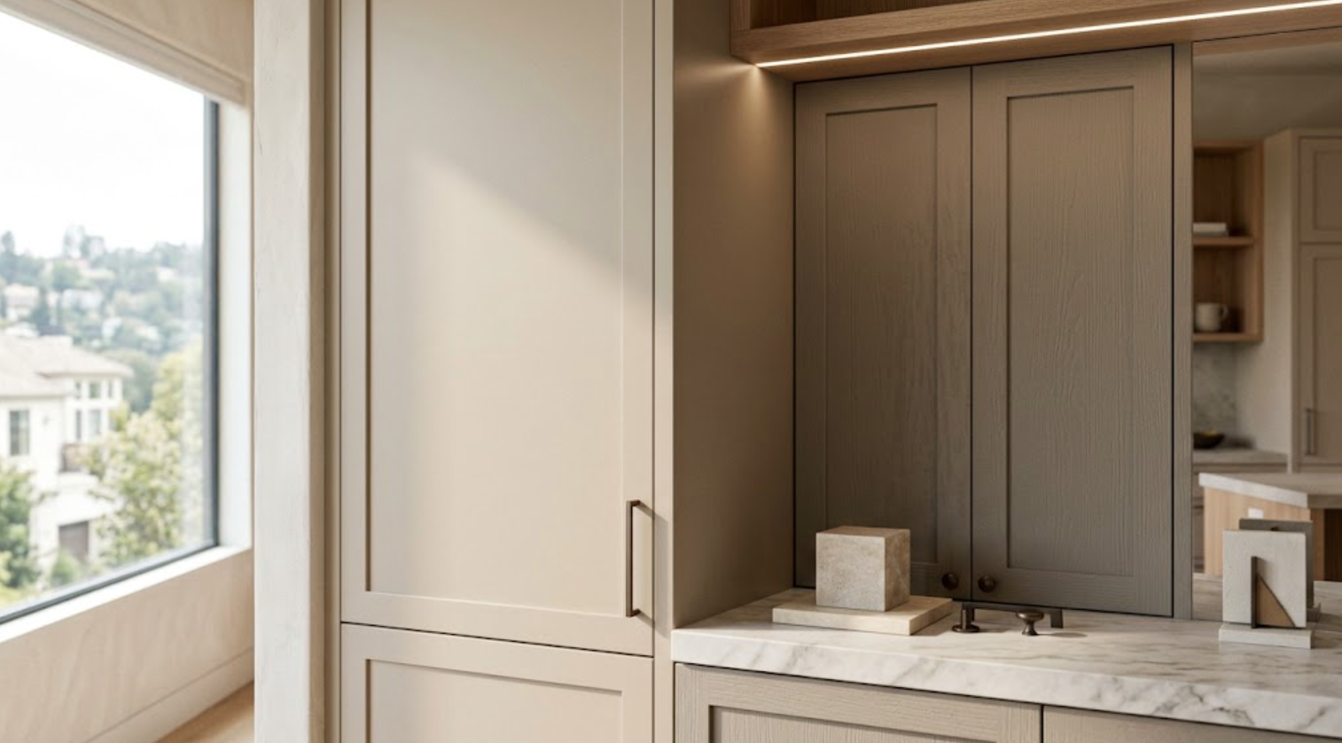
What Are Glazed Finishes?
Glaze adds another layer over paint or stain.
Dura Supreme currently distinguishes between full-coverage glaze and accent glaze.
A full-coverage glaze is applied across the finish and affects the overall base color, while an accent glaze is applied primarily along profiles and edges to emphasize cabinet details.
This creates more depth.
It also makes the door profile more visually pronounced.
When Do Glazed Finishes Make Sense?
When the architecture benefits from additional articulation.
They can work particularly well in:
Traditional interiors
Furniture-like cabinetry
Detailed inset applications
Libraries
Bars
Decorative islands
But glaze is not necessary simply because a door has detail.
For quieter contemporary or transitional projects, a clean paint or stain may allow the architecture to feel more restrained.
What About Distressed and Heritage Finishes?
Dura Supreme also offers hand-detailed treatments intended to create aged or time-worn appearances.
Its Heritage Paint collection uses layered finishes, glaze, and distressing techniques to create more traditional furniture-like effects.
These are highly specific aesthetic tools.
They should be selected because the architecture supports that character.
Not because additional detailing is available.
Are There Contemporary Finishes Beyond Wood and Paint?
Yes.
Dura Supreme’s current finish library also includes contemporary materials such as:
Textured TFL
Sculpted TFL
Matte TFL
Matte Foil
Acrylic High Gloss
Acrylic Ultra Matte
Wired Gloss Foil
Exotic veneers
Laminate
These materials expand the collection beyond conventional stained and painted cabinetry.
For designers, they can be useful when the project requires more consistency, unusual texture, very matte surfaces, high gloss, or a more contemporary material expression.
How Should Designers Decide Whether to Use a Contemporary Surface?
Ask what the surface contributes that natural wood or paint does not.
Perhaps the project needs:
Extremely consistent color
A highly controlled wood-like texture
A sculpted surface
A very matte finish
High gloss
A specialty veneer
The material should solve a design problem.
It should not be selected simply because it appears different.
Should One Kitchen Use More Than One Finish?
It can.
Two-finish kitchens can create hierarchy.
For example:
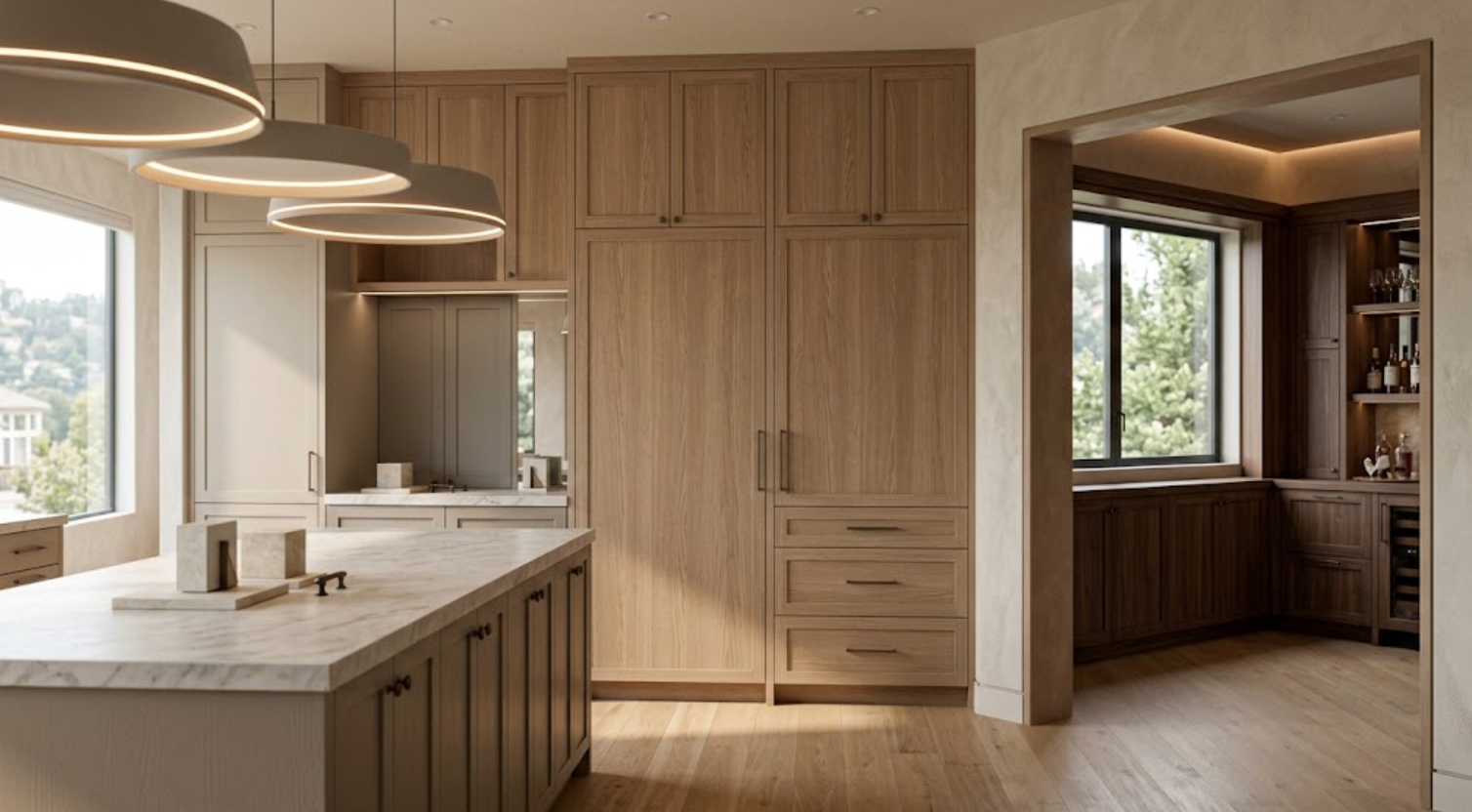
Painted perimeter cabinetry with a Quarter-Sawn White Oak island
Natural wood tall cabinetry with painted lower cabinets
A walnut feature wall with quieter painted cabinetry
But contrast should have a reason.
Changing finish every time the cabinetry changes function can fragment the room.
Usually one primary finish and one secondary finish are enough.
How Should Finish Changes Be Located?
At architectural boundaries.
An island is a natural place for change.
So is:
A freestanding pantry wall
A bar
A separate tall-cabinet composition
A furniture-like hutch
A clearly defined secondary zone
Finish changes become easier to understand when they correspond to something the architecture is already doing.
How Should Dura Supreme Finishes Work Across an Entire Residence?
Through hierarchy rather than exact repetition.
The kitchen may establish the primary wood. The primary bathroom can use a related painted finish. The home office may introduce a deeper stain. The bar can use Walnut. The laundry room may simplify the palette.
The goal is to make the materials feel related without making every room identical.
A broad finish collection is especially useful when it is edited into a smaller whole-home material story.
Why Should Physical Samples Be Reviewed Together?
Because no finish exists alone in the finished home.
Dura Supreme cautions that colors displayed on a computer screen will not accurately match the finished product and recommends reviewing several physical door samples and displays before making finish selections.
That is particularly important for designers.
Put the cabinet sample beside:
Stone
Flooring
Wall finish
Hardware
Adjacent woods
Tile
Then move the combination into different light.
The relationship matters more than the sample in isolation.
How Much Does Lighting Change Cabinetry?
Significantly.
Dura Supreme notes that finish tone and color can appear different under different lighting conditions and in different environments.
A light wood can become warmer in afternoon sun.
A gray paint may shift cooler under some artificial lighting.
A deep green can appear nearly charcoal in lower light.
A warm white can become noticeably creamier beside certain stones.
Material approval should account for those changes.
Should Designers Bring Samples to the Project Site?
When possible, yes.
Especially for major cabinetry areas.
A showroom provides a controlled place to compare options.
The project site provides the actual architectural context.
Reviewing the strongest candidates in both environments can reveal things that photographs cannot.
This becomes particularly useful when cabinetry occupies a large percentage of the room.
How Many Finish Options Should Be Presented to the Client?
Usually fewer than are available.
Dura Supreme’s finish range is broad.
That does not mean the client needs to see the entire collection.
The designer can narrow the possibilities according to:
Architecture
Flooring
Stone
Lighting
Other woods
Whole-home palette
Then present the strongest two or three directions.
That turns an enormous finish library into a useful design decision.
What Should Designers Confirm Before Approving a Finish?
The exact combination.
Confirm:
Cabinetry material
Wood species or substrate
Finish name
Stain or paint
Any glaze
Any cerused treatment
Door style
Construction
Grain expectations
Custom-color approval where applicable
Any specialty finish
A finish name alone does not describe the entire result.
The substrate and door matter too.
How Should Designers Explain Natural Variation to Clients?
Before the order.
Not after installation.
Clients should understand that natural wood can vary in:
Grain
Tone
Figure
Mineral characteristics
Board-to-board appearance
A sample establishes the intended direction.
It does not turn natural wood into a perfectly uniform manufactured surface.
That distinction can prevent unrealistic expectations later.
What Is the Best Way to Choose a Dura Supreme Cabinet Finish?
Work from large decisions toward small ones.
First:
Wood or paint?
Then:
Which species or substrate?
Then:
What tonal direction?
Then:
Which specific finish?
Then:
How does it work with the door style?
Then:
How does it work with stone, flooring, hardware, walls, and light?
Finally:
How does it fit into the cabinetry palette for the rest of the residence?
That process keeps the finish connected to the design.
Dura Supreme Cabinet Finishes: A Guide to Woods, Stains & Paints
Dura Supreme offers designers a broad finish vocabulary:
Natural woods
Stains
Paints
Cerused Quarter-Sawn White Oak
Painted oak
Custom paint
Glazes
Specialty veneers
Contemporary surfaces
That breadth is valuable when it is edited carefully.
The wood should support the architecture.
The stain should work with the grain.
The paint should relate to the surrounding palette.
Texture should have a reason.
Custom color should solve a real design need.
Every major finish should be evaluated physically, beside the materials it will actually meet.
The best cabinetry finish is rarely the one that looks most interesting on the sample wall.
It is the one that makes the entire room feel more resolved.
Explore Dura Supreme Cabinet Finishes With Atelier Design Society
Atelier Design Society works with interior designers, architects, builders, homeowners, and other design professionals evaluating premium cabinetry materials and finishes for sophisticated residential projects throughout the Bay Area.
At the Atelier Design Society showroom in Menlo Park, designers can compare Dura Supreme cabinetry finishes alongside door styles, construction, hardware, interior storage, stone, and other project materials.
Bring flooring, stone, plaster or paint references, hardware, architectural drawings, and other cabinetry selections when available.
The objective is not to review every available Dura Supreme finish.
It is to identify the few that belong in the project.