How Designers Build a Cohesive Material Palette for a Kitchen
A cohesive kitchen does not come from choosing a cabinet finish, countertop, hardware, flooring, and wall color independently and hoping they work together at the end. Designers build the palette as a system. Each material is evaluated according to what is already happening in the room, what it sits beside, how much visual space it occupies, and what role it needs to play.
This is especially important in luxury kitchens because the materials are often substantial architectural elements. Full-height cabinetry may cover an entire wall. A natural stone slab can become the focal point of an island or backsplash. Flooring extends beyond the kitchen into adjoining rooms. Hardware and plumbing introduce metal, while plaster, paint, or wallcovering establishes the background around everything else.
The strongest palettes are not necessarily the ones with the most expensive materials or the greatest amount of contrast. They are the ones with a clear hierarchy. One material may lead, another may provide warmth, another may create contrast, and several quieter finishes may simply connect the composition. Designers build that hierarchy intentionally, then test every selection against the whole room rather than evaluating it alone.
Where Does a Designer Start Building a Kitchen Material Palette?
The starting point depends on the project. There is no rule that cabinetry must always come first or that stone should always lead. Instead, designers identify the material or architectural element with the greatest influence on the room.
In one kitchen, that may be rift-cut white oak cabinetry extending across several walls. In another, it may be an exceptional natural stone slab selected for a large island. A renovation may already have flooring that needs to remain. A new custom home may have an architectural concept based around warm plaster, natural oak, and dark metal.
Once that anchor is established, the rest of the palette can respond to it. This prevents the design process from becoming a collection of unrelated favorites.
A useful starting framework is:
Identify the anchor material: cabinetry, stone, flooring, or another major architectural finish.
Establish its undertone: warm, cool, neutral, red, yellow, gray, green, or another subtle direction.
Understand its pattern: quiet, linear, figured, veined, mottled, or highly expressive.
Determine its visual weight: will it dominate the room or act as a background?
Consider its scale: a small material sample may eventually occupy an entire wall, island, or floor.
Decide what the remaining materials need to do: reinforce, contrast, soften, or stay quiet.
This gives the palette a design logic before dozens of individual selections enter the conversation.
Why Is Material Hierarchy So Important?
If every material is trying to become the focal point, the kitchen can feel visually exhausting. Highly figured walnut, dramatic quartzite, patterned flooring, decorative hardware, and a strong wall treatment may all be beautiful individually, but together they can compete.
Hierarchy determines which materials deserve attention and which should provide support. If a quartzite island has extraordinary movement, cabinetry may need simpler door profiles and controlled grain. If custom walnut cabinetry is the architectural feature, the countertop may be quieter. If the kitchen is intentionally monochromatic, texture and sheen may create depth instead of strong color contrast.
Designers are not simply asking, “Do these materials match?” They are asking, “What is the eye supposed to notice first, and what happens next?”
How Do Designers Coordinate Undertones?
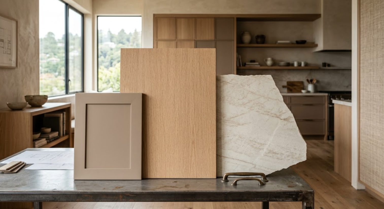
Undertone is one of the most important parts of material coordination because materials that appear neutral can behave very differently beside one another. White oak may lean pale and neutral, warm and golden, or slightly gray depending on the cut and finish. A white countertop may contain blue-gray, cream, taupe, or even subtle green undertones. Painted cabinetry can shift significantly depending on surrounding materials and light.
Designers compare physical samples directly rather than relying on names such as “warm white,” “natural oak,” or “greige.” Those descriptions are too broad to determine whether two materials actually belong together.
The goal is not to make every undertone identical. In fact, exact matching can make a palette feel flat. The goal is to make the relationships intentional. Warm white stone may bridge natural oak and mushroom cabinetry. A cooler stone may create deliberate contrast against walnut. Muted green cabinetry may connect beautifully to mineral movement in a natural slab without copying its exact color.
Should Every Material Be Warm or Cool?
No. A cohesive palette can include both warm and cool elements.
The important question is whether the contrast feels deliberate. Warm white oak paired with a slightly cooler gray stone can create clarity, particularly in contemporary architecture. Walnut can look sophisticated against a cooler mineral surface when another element, such as bronze hardware or warm plaster, connects the two.
Problems occur when temperatures are only slightly different in a way that appears accidental. A blue-white countertop beside yellow-toned oak can exaggerate the warmth of the wood. Two almost-matching creams can reveal an unwanted pink or green undertone once installed together.
Physical comparison is the safest way to identify these relationships.
How Should Cabinetry Influence the Rest of the Palette?
Cabinetry often occupies more visual area than any other kitchen material except flooring, so its color, grain, door style, and finish have significant influence.
Natural wood cabinetry already contains pattern. Rift-cut white oak creates controlled linear movement. Walnut may introduce stronger color variation and grain. Painted cabinetry creates a more uniform surface, allowing stone or another material to become more expressive.
Designers consider both the amount and type of cabinetry in the room. A single white oak island has a very different visual impact from three walls of full-height oak cabinetry. The larger the application, the more important it becomes to control the materials around it.
How Do Designers Pair White Oak With Other Materials?
White oak is versatile, but it is not a blank neutral. The exact finish should be established before surrounding materials are finalized.
Pale rift-cut white oak can work with creamy quartzite, warm-white quartz, limestone-inspired surfaces, taupe, charcoal, muted green, and many other directions. What matters is the relationship between the specific oak sample and the specific surface.
If the oak has visible warmth, a cool blue-white countertop may exaggerate yellow tones. A creamy or taupe surface may create a softer transition. Darker stone can provide stronger architectural contrast.
Flooring also matters. When both cabinets and floors are white oak, designers often create enough difference in value, grain, or finish to prevent the two surfaces from looking like an unsuccessful attempt at an exact match.
How Does Walnut Change the Palette?
Walnut carries more natural color and often more visual depth than pale oak. That can make it one of the dominant materials in the kitchen.
Designers frequently allow walnut to lead by pairing it with quieter surfaces such as creamy stone, warm gray, taupe, soft white, or deeper charcoal. Highly active stone can still work, but the amount of pattern across the entire room needs to be considered.
Walnut also interacts strongly with metal. Warm bronze can create a tonal relationship, while darker metal adds definition. Cooler nickel can provide deliberate contrast when it connects to plumbing, appliances, or other architectural details.
How Do Designers Decide How Much Stone Movement a Kitchen Needs?
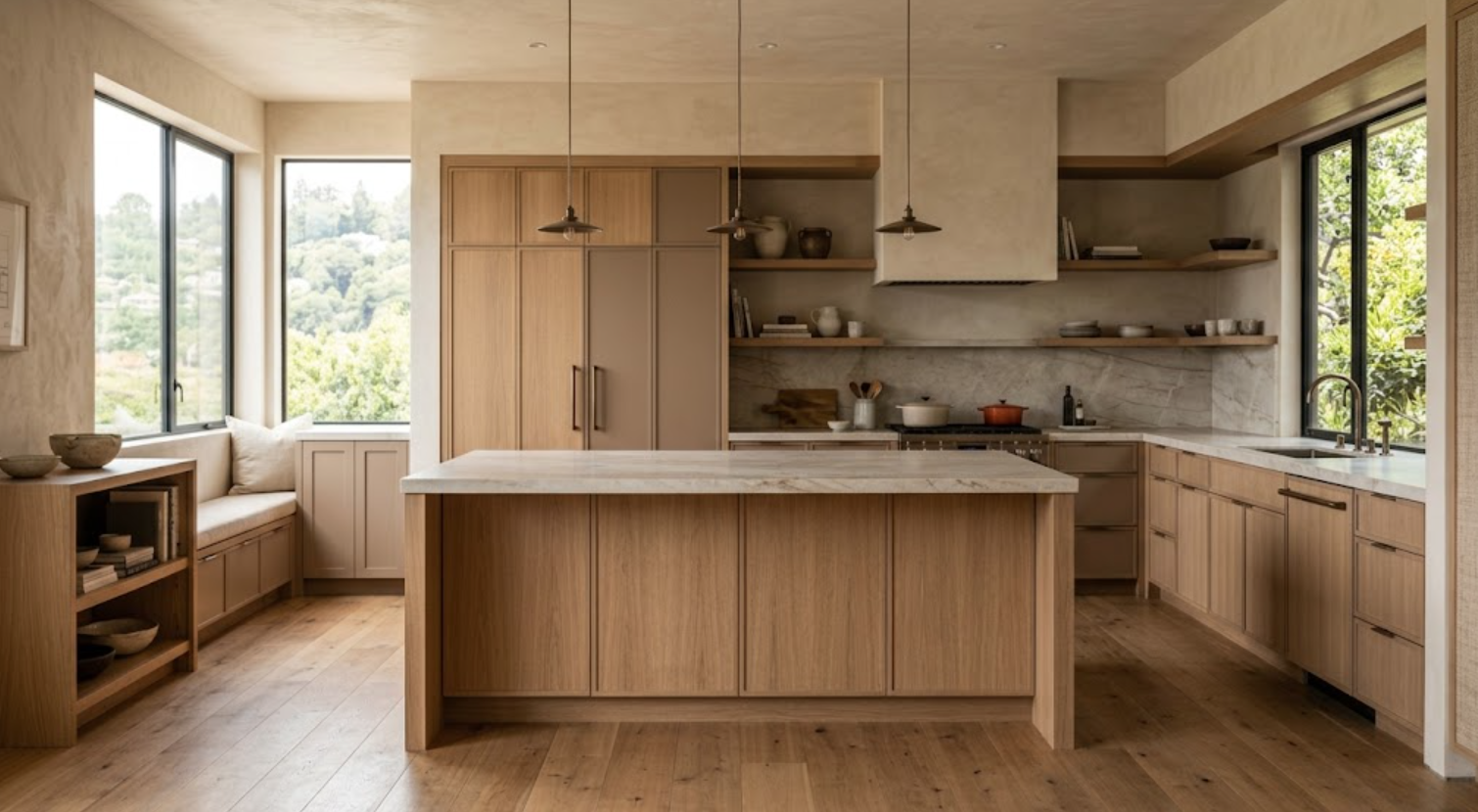
Stone introduces another pattern into the room, so designers evaluate it in relation to cabinetry grain, flooring, backsplash, and architecture.
If the cabinetry is quiet and painted, a highly expressive quartzite may become the focal point. If the kitchen already contains extensive walnut or strongly figured wood, a quieter stone can provide balance. If both materials are expressive, designers often look for differences in scale. Broad mineral movement can coexist with controlled linear wood grain more successfully than two similarly busy patterns.
The amount of stone also matters. A dramatic slab used only on an island creates a different effect from the same material covering the island, perimeter, backsplash, and waterfall ends. More material does not automatically create a more luxurious result.
Should the Countertop Match the Cabinetry?
Matching is usually less important than creating a relationship. Designers may connect cabinetry and countertops through a shared undertone, but they can also use contrast deliberately.
For example, pale oak and creamy quartzite may create a tonal palette, while pale oak and deep charcoal stone create a much stronger graphic relationship. Both can be cohesive.
The decision depends on the architecture and desired hierarchy. A quiet room may rely on subtle tonal differences. A more sculptural contemporary kitchen may benefit from stronger value contrast.
What Role Does the Backsplash Play?
The backsplash can either extend the countertop material or introduce another finish. Continuing stone vertically creates a strong architectural surface and reduces the number of materials in the room. Tile can introduce texture, scale, or handcrafted variation. Plaster may allow the cabinetry and countertop to remain dominant.
The backsplash should not be selected simply because the kitchen “needs something there.” Designers ask what the palette is missing. If the countertop already has substantial movement, another patterned backsplash may create unnecessary competition. If the cabinetry and countertop are extremely quiet, a more textural backsplash may provide useful depth.
How Do Designers Use Painted Cabinetry Within a Material Palette?
Painted cabinetry can function as a visual pause between natural materials. A kitchen might combine white oak tall cabinetry, mushroom-painted perimeter cabinets, and natural stone. The painted finish reduces the amount of visible wood grain and gives the stone more space.
Paint can also bridge materials that would otherwise feel disconnected. A carefully selected taupe or warm neutral may connect oak flooring to a creamy countertop. Muted green can introduce color while still relating to natural woods and mineral surfaces.
The exact paint color should always be reviewed beside the physical cabinet wood, countertop, flooring, and wall finish. Paint is highly responsive to surrounding color and light.
How Do Hardware and Plumbing Fit Into the Palette?
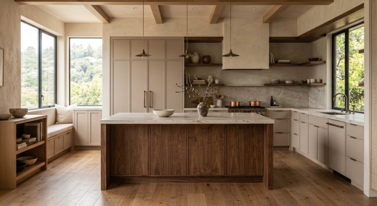
Metal may occupy less surface area than cabinetry or stone, but it appears repeatedly throughout the kitchen. Cabinet pulls, faucets, pot fillers, lighting, appliance trim, and architectural details can create either continuity or fragmentation.
Designers usually establish a metal strategy rather than selecting each piece independently. That does not mean every finish has to match exactly. Aged bronze hardware may coexist with dark architectural steel, while polished nickel plumbing introduces a brighter accent. What matters is that each metal has a reason to be present.
Hardware should also be evaluated against the actual cabinet finish. Darkened metal may create clear definition on pale oak. Bronze can feel more integrated with walnut. Nickel may sharpen painted cabinetry. The proportion of the hardware matters as much as its finish because it becomes part of the cabinet elevation.
How Does Flooring Affect the Kitchen Palette?
Flooring creates a large visual field beneath every other material, and in open-plan homes it often continues far beyond the kitchen. That makes it one of the most important references when selecting cabinetry and stone.
When wood flooring meets wood cabinetry, designers look at undertone, grain, value, and finish rather than trying to create an exact match. A slightly deeper floor can ground pale cabinetry. A quieter cabinet grain can contrast with more varied floorboards. If the flooring is stone or another hard surface, its pattern must be considered alongside the countertop.
Existing flooring can also become the starting constraint in a remodel. Rather than fighting it, the cabinetry palette should be developed with it from the beginning.
What About Wall Color, Plaster, or Wallcovering?
Walls influence how every material is perceived. Warm plaster can soften natural wood and stone. Crisp white paint can increase contrast. A woven wallcovering can add texture without introducing another hard surface. A stronger patterned wallcovering may become a significant part of the hierarchy.
Designers evaluate wall treatments according to how much exposed wall remains after cabinetry is installed. A dramatic wallcovering covering a large dining wall has far more influence than the same material inside one small bar niche.
The wall treatment should add something the palette needs rather than another layer simply for decoration.
Why Does Texture Matter as Much as Color?
A cohesive palette can use very similar colors and still feel rich when the textures are different. Consider white oak cabinetry, creamy honed stone, warm plaster, woven wallcovering, and aged bronze. The palette may remain within a narrow range of warm neutrals, yet every material responds to light differently.
Wood contributes grain. Stone provides mineral depth. Plaster creates subtle surface variation. Metal introduces controlled reflection. Woven material adds softness.
Texture is particularly important in restrained kitchens because it prevents a neutral palette from feeling flat.
How Do Designers Balance Matte and Reflective Surfaces?
Sheen is another form of contrast. A kitchen filled entirely with polished surfaces can become visually restless, while an entirely matte palette may lack dimension.
Designers often allow one or two materials to provide controlled reflection. Honed stone might sit beside matte cabinetry and plaster, while polished or aged metal creates small highlights. Alternatively, polished stone can introduce light into a kitchen dominated by natural wood and matte finishes.
The amount of daylight matters too. A highly reflective surface behaves differently in a bright glass-walled kitchen than in a darker interior room.
How Does Natural Light Change Material Selection?
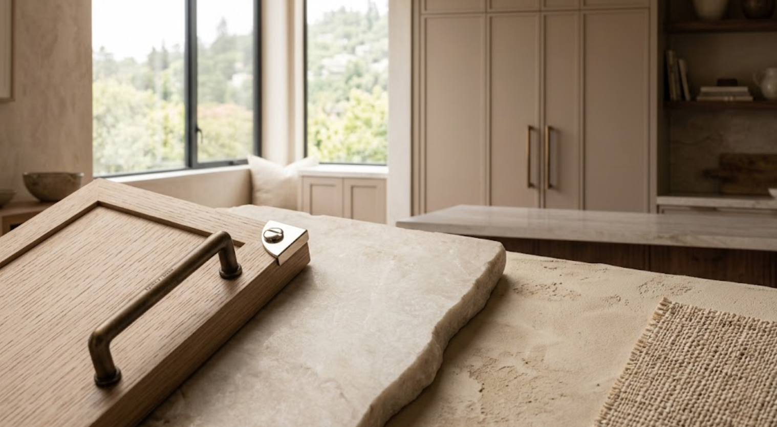
Materials should be evaluated in the light they will actually experience. A cabinet finish approved under showroom lighting may behave differently beside large west-facing windows. Warm afternoon light can intensify yellow and red undertones. Cooler daylight may make gray or green undertones more visible.
Designers consider window orientation, glazing, overhangs, surrounding landscape, and the amount of artificial light used during different parts of the day. Samples may be moved around the room and viewed vertically as well as horizontally because orientation also affects how light hits the surface.
This is particularly important for natural wood, stone, paint, plaster, and metallic finishes.
Why Should Materials Be Reviewed at the Correct Scale?
Small samples are useful for narrowing options, but they can distort perception. A stone sample may hide major veining. A small piece of walnut may not show the range of grain and color. A hardware finish chip says nothing about the proportion of the actual pull. A wallcovering sample may appear quiet until its pattern repeats across an entire wall.
Before final approval, designers try to review materials at the largest practical scale:
Large cabinet-door samples
Full stone slabs or large-format surface samples
Actual hardware
Flooring boards assembled together
Large paint or plaster areas
Large wallcovering memos
Full-scale cabinetry displays when available
Scale reveals repetition, movement, proportion, and variation that small samples cannot.
How Do Designers Use a Material Board Effectively?
A useful material board is not simply a collection of everything selected for the room. It should communicate hierarchy.
If cabinetry occupies most of the kitchen, the cabinetry sample should have significant visual presence. If stone is limited to one island, it should not dominate the board unless the island is intentionally the focal point. Hardware should remain smaller because that reflects its role in the actual room.
Designers also place materials beside the surfaces they will actually touch. Countertop against cabinet finish. Flooring beneath cabinetry. Hardware directly on the door sample. Wall finish behind the cabinet and stone.
This reveals relationships more accurately than arranging samples as isolated squares.
How Do Designers Know When a Palette Is Too Busy?
A useful test is to look for competition. If the eye cannot determine where to rest, several materials may be performing the same job.
Common causes include:
Strong wood grain beside equally busy stone
Patterned backsplash competing with a dramatic countertop
Too many unrelated metals
Flooring with substantial movement beneath expressive cabinetry
Strong wallcovering added to an already active room
Several materials with similar high contrast
Too many “feature” finishes
The solution is usually not to redesign everything. Often one material simply needs to become quieter.
What If the Palette Feels Too Safe?
The opposite can happen. A kitchen may be beautifully coordinated but lack enough contrast or identity.
Instead of adding several new materials, designers identify one place where a stronger move would have the greatest effect. That might be a darker island, a more expressive stone, a richer walnut cabinet, a deeper wall color, or a stronger metal finish.
One deliberate contrast is often more effective than several smaller decorative gestures.
How Do Designers Coordinate a Kitchen With Adjacent Rooms?
Open-plan homes require designers to look beyond the kitchen boundaries. From the island, the eye may also see a dining wall, fireplace, bar, living-room built-ins, and exterior materials.
Those finishes do not need to match the kitchen, but they should belong to the same broader language. The kitchen’s bronze hardware may relate to architectural metal elsewhere. Walnut at the bar may connect to a smaller walnut element in the kitchen. Warm plaster may continue through several spaces while cabinetry finishes change.
Sightlines are particularly important. Two strong stones that are individually beautiful may compete if both are visible from the same position.
Should Every Material Repeat Somewhere Else?
No. Repetition can create continuity, but forcing every material to appear more than once can make a home feel overly coordinated.
Designers often repeat quieter elements instead. A metal family, wood undertone, plaster color, or general stone temperature may travel through the residence while more distinctive materials remain specific to one space.
An extraordinary island stone may appear only in the kitchen. That scarcity can make it more important.
How Do Designers Keep a Neutral Kitchen From Feeling Flat?
Neutral does not need to mean monochromatic or bland. Designers create depth through value, texture, grain, sheen, and material variation.
A restrained palette might include:
Pale rift-cut white oak
Creamy honed quartzite
Slightly deeper natural oak flooring
Warm plaster
Mushroom-painted cabinetry
Aged bronze hardware
None of those materials needs to be dramatically colorful. The differences in tone and texture create enough visual separation.
The key is avoiding exact sameness. If the cabinets, floor, stone, walls, and paint are all nearly identical beige values, the room can lose definition.
Why Do Physical Samples Matter More Than Digital Images?
Screens are useful for research and early direction, but they cannot reliably communicate exact undertone, texture, sheen, or natural variation. Photography, editing, screen brightness, and surrounding colors can all change perception.
A designer may use digital references to establish a concept, but final coordination should happen with physical materials whenever possible. Cabinet finishes should sit beside the actual stone. Hardware should be placed on the cabinet door. Flooring should be viewed beneath both. Paint or plaster should be large enough to understand its undertone.
The closer the project gets to final approval, the more important physical comparison becomes.
What Should Be Finalized Together?
Not every selection needs to happen on the same day, but the major architectural materials should be reviewed as a group before final commitments are made. At minimum, that includes cabinetry, countertops, backsplash direction, flooring, major wall finish, hardware, plumbing finish, appliance finish, and lighting considerations.
The process can remain flexible. The designer may begin with cabinetry and stone, then introduce flooring and hardware, then refine paint and wall finishes. What matters is that each new decision is tested against the existing palette.
What Is the Final Test for a Cohesive Kitchen Palette?
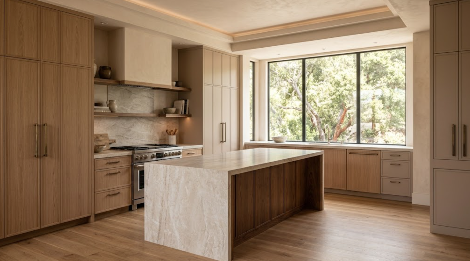
Before approving the palette, stop evaluating each material individually and look at the complete composition. Ask whether there is a clear hierarchy, whether undertones cooperate, whether patterns are balanced, whether the room contains enough contrast, and whether any material is competing unnecessarily.
Also consider how the palette changes with scale and light. The cabinetry may look quiet as one door sample but become much more visually dominant across an entire wall. A stone may seem subtle in a small piece but reveal substantial movement across a full slab. Hardware that looks bold in the hand may become appropriately restrained once repeated across twenty cabinet fronts.
A cohesive palette should still work when every material reaches its actual architectural scale.
How Designers Build a Cohesive Material Palette for a Kitchen
Designers build cohesive kitchens by creating relationships rather than collecting matching finishes. They begin with the strongest material or architectural constraint, establish a hierarchy, coordinate undertones, balance patterns, and control the amount of contrast. Cabinetry, stone, flooring, hardware, walls, and lighting are then developed as parts of one composition.
The most successful palettes also leave room for quiet. Not every surface needs dramatic veining, distinctive grain, strong color, or decorative detail. Some materials should lead while others create the background that allows those materials to matter.
That balance is what makes a kitchen feel resolved. The cabinetry does not look as though it was selected separately from the countertop. The flooring does not feel inherited from another palette. The hardware does not appear added at the end. Every material contributes something different while still belonging to the same architectural idea.
Build Your Kitchen Material Palette With Atelier Design Society
Atelier Design Society works with homeowners, architects, interior designers, builders, and other design professionals developing premium cabinetry and material palettes for sophisticated Bay Area kitchens. At the Atelier Design Society showroom in Menlo Park, project teams can compare cabinetry materials, natural woods, painted finishes, stone, engineered surfaces, hardware, flooring, and related architectural finishes while evaluating undertone, grain, movement, texture, scale, and visual hierarchy.
Bring cabinetry references, stone samples or slab photographs, flooring, hardware, paint or plaster samples, appliance information, and architectural plans when available. Reviewing those materials together makes it easier to identify what should lead, what should support it, and what the kitchen does not need.