How to Coordinate Cabinetry, Stone, Hardware & Wallcoverings
The most sophisticated interiors rarely depend on one extraordinary material. They depend on relationships between materials.
Cabinetry establishes scale, rhythm, and a significant portion of the room's color. Stone introduces mineral movement and texture. Hardware creates smaller points of contrast and reflection. Wallcoverings can add pattern, depth, softness, or another layer of material character.
Each selection may be beautiful independently. That does not mean they belong together.
A richly figured walnut cabinet can compete with dramatic stone. A warm white oak may suddenly appear yellow beside a cool wallcovering. Highly veined quartzite, decorative hardware, and a patterned wall can each demand attention until the room has no clear focal point.
Successful material coordination is therefore less about finding four impressive finishes and more about deciding what each finish is supposed to contribute:
Which material leads?
Which materials support it?
Where should the eye rest?
Where should contrast occur?
Which colors need to repeat?
Which should appear only once?
Designers answer those questions before every surface becomes permanent. Because a coordinated room should feel layered. Not assembled.
Why Should Cabinetry Be Part of the Material Palette From the Beginning?
Cabinetry is too visually significant to be treated as a background decision. In a kitchen, it may cover an entire wall. In a bar, library, office, or primary bathroom, it can effectively become part of the architecture.
Its material influences every finish placed beside it. Consider the difference between:
Pale rift-cut white oak.
Rich walnut.
Warm mushroom paint.
Deep charcoal paint.
Muted mineral green.
Each creates a completely different environment for the stone, hardware, and wall treatment. The cabinetry finish should therefore enter the material conversation early. Not after every other finish has already been selected.
What Should You Select First?
There is no universal order. Instead, identify the least flexible or most visually important material.
If the project is built around an extraordinary natural stone slab, start there. If the architecture depends on a particular walnut cabinetry direction, begin with the wood. If a hand-painted wallcovering is fundamental to the room, that may become the anchor.
The first material should be the one that establishes the strongest design constraint. Everything else can then respond.
What Is a Material Hierarchy?
A material hierarchy determines which finishes carry the most visual weight.
Imagine a kitchen with dramatic quartzite. That stone may be the primary material statement. The cabinetry can remain quieter. Hardware becomes restrained. Wallcovering, if present, may introduce texture rather than another strong pattern.
Now imagine the same room with exceptional walnut cabinetry. The wood may become the dominant material. Stone becomes calmer. Hardware can provide subtle definition. Walls remain quiet.
Both rooms can feel layered. But their hierarchies are different
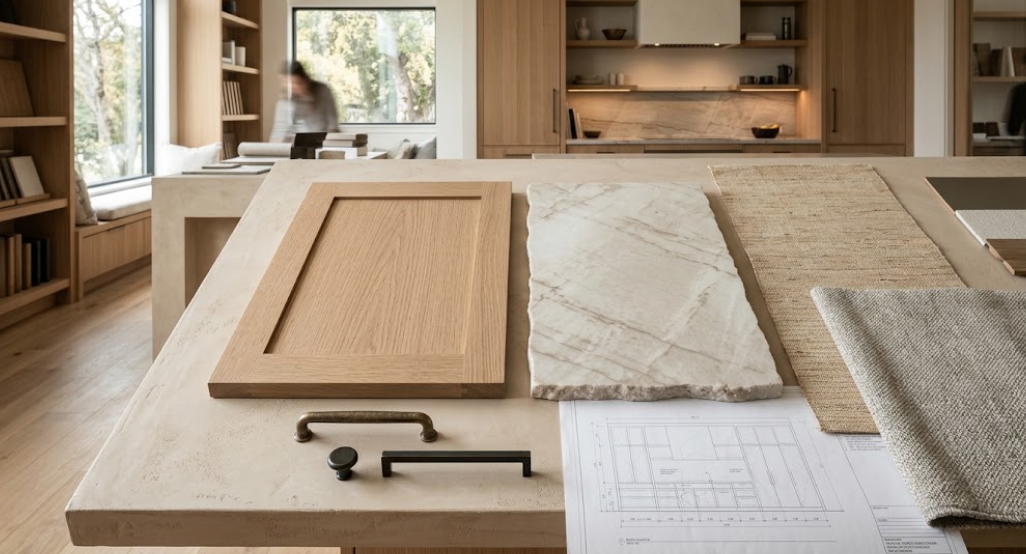
How Do You Coordinate Cabinetry and Stone?
Start with undertone. Then consider movement.
A warm wood such as walnut or white oak can pair beautifully with creamy stone, taupe mineral movement, warm gray, or even deliberate cooler contrast. Painted cabinetry introduces another possibility because its color is more controlled.
But color alone is not enough. The grain of the cabinetry and movement of the stone also need to coexist. If both are highly expressive, the room may become visually restless.
Should Stone Match the Cabinetry?
No. The materials should relate without imitating one another.
A walnut cabinet does not require brown stone. White oak does not require beige. Green cabinetry does not require green veining.
Often, a subtle shared undertone is enough. Perhaps the stone contains a small amount of warmth that connects to the wood. Perhaps a cool mineral vein relates to the painted cabinetry. Perhaps contrast is intentional and another finish bridges the difference.
The goal is connection. Not duplication.
How Much Pattern Can Cabinetry and Stone Carry Together?
That depends on which one leads.
Slab-front rift-cut white oak contains visible linear grain. A highly figured quartzite introduces another pattern directly beside it. That can work when the scale of each pattern is different:
Controlled vertical wood grain.
Large sweeping mineral movement.
The contrast between the two can be beautiful. But highly figured wood paired with small, busy stone movement may create too much visual activity.
Step back from the samples. Look at the patterns as they will appear across entire elevations.
What Happens With Painted Cabinetry?
Paint removes most of the natural grain variation from the cabinet surface. That gives stone more room.
A quiet mushroom-painted kitchen may support a highly expressive quartzite. Deep green cabinetry might pair with restrained creamy stone. Warm white inset cabinetry can provide a calm frame around marble.
Paint can function almost like an architectural field of color. That makes it particularly useful when another material needs to become the focal point.
How Do You Coordinate Hardware With Cabinetry?
Hardware should reinforce the cabinetry rather than decorate it after the fact.
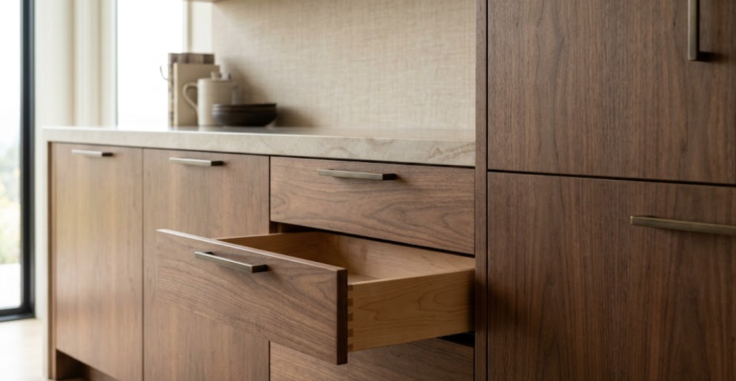
First consider contrast. Dark hardware on pale oak creates clear definition. Warm bronze on walnut creates a softer relationship. Polished nickel on painted cabinetry introduces more reflectivity and precision.
Hardware can either disappear into the cabinet finish or intentionally become visible. Neither approach is inherently better. The decision should relate to the room.
Should Hardware Match the Cabinetry Undertone?
Not exactly. But temperature matters.
Warm bronze can reinforce creamy stone and warm wood. Cooler nickel can sharpen painted cabinetry and cooler stone. Blackened metal can introduce contrast across several material palettes.
The metal should also be evaluated against the stone. Hardware may sit on cabinetry, but it is often viewed directly beside a countertop or backsplash.
Does Every Metal Finish in the Room Need to Match?
No. Exact matching can sometimes make a room feel overly prescribed.
Cabinet hardware.
Plumbing fixtures.
Lighting.
Appliance details.
Architectural metalwork.
These elements can be related without being identical. The key is controlling the number of metal families.
For example, aged bronze hardware and blackened architectural steel can coexist because both have depth and warmth. A polished nickel faucet might intentionally introduce a brighter metal. But adding several unrelated metals without hierarchy can make the room feel fragmented.
How Many Metal Finishes Should You Use?
There is no fixed number. The better question is whether each additional metal is necessary.
If one finish can handle cabinetry, plumbing, and several lighting details elegantly, there may be no reason to introduce another. If a second metal creates useful contrast, add it deliberately. Avoid variety for its own sake.
What About Appliance Finishes?
Appliances should be included in the metal conversation. Stainless steel can introduce a large amount of cool metal into a kitchen. Panel-ready appliances reduce that effect by allowing cabinetry to remain visually dominant.
If stainless appliances are exposed, consider how they interact with:
Hardware.
Faucets.
Lighting.
Stone.
The appliance finish is part of the palette whether or not it was selected as a decorative material.
Why Are Wallcoverings Different From Paint?
Paint creates color. Wallcovering can create color and another material layer.
Depending on the product, it may introduce:
Woven texture.
Grasscloth.
Linen character.
Metallic detail.
Geometric pattern.
Botanical imagery.
Hand-painted effects.
Large-scale mural movement.
That makes wallcovering powerful. It also makes coordination more complicated. A wallcovering can behave almost like another stone or wood surface in the room.
Where Should Wallcovering Enter the Selection Process?
Earlier than many people expect.
If the wallcovering has a strong pattern or color, it should be considered alongside cabinetry and stone. Not after they are installed. A quiet textural wallcovering can be selected later with more flexibility.
But a large-scale pattern may influence:
Cabinet color.
Stone movement.
Hardware.
Lighting.
Even how much artwork the room needs.
Treat expressive wallcovering as a major finish.
Should Wallcovering Match the Cabinets?
Again, relationship is more important than matching.
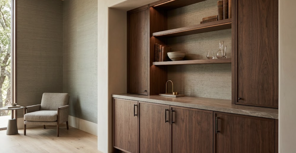
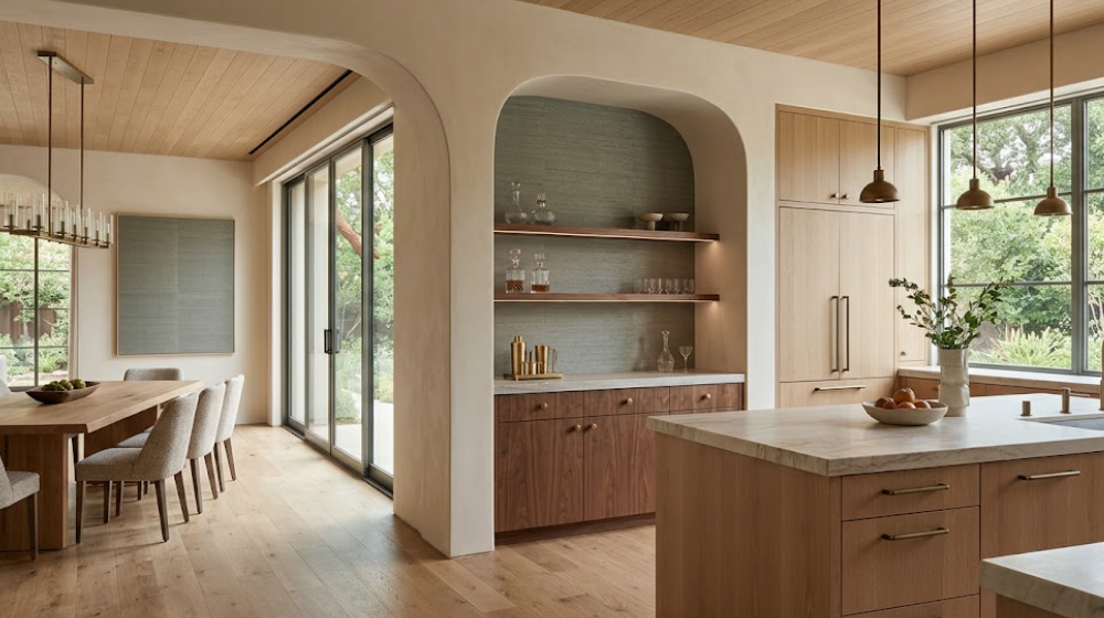
A mushroom-painted cabinet might sit beautifully against a warmer woven wallcovering. Walnut can work with muted green, taupe, cream, or even deeper color. White oak can pair with soft mineral shades and natural fibers.
The wall does not need to reproduce the cabinet color. It needs to create the right amount of separation.
How Do You Pair Wallcovering With Natural Wood?
Pay attention to grain. Wood already has directional pattern. So does many wallcovering.
If the cabinetry has strong vertical grain, a highly linear wallcovering immediately beside it may either reinforce that rhythm or compete with it. A softer woven texture may create enough variation without adding another obvious direction. Large-scale botanical or abstract patterns require even more consideration.
The amount of exposed wall matters too. A small niche can handle something very different from an entire room.
Can You Use Patterned Wallcovering With Dramatic Stone?
Yes. But one should usually have more visual authority.
Imagine dramatic quartzite with broad veining. Now add a high-contrast geometric wallcovering. Both materials are trying to create movement. The combination may work in a deliberately maximal interior. But if the goal is restrained luxury, one pattern usually needs to become quieter.
A dramatic stone might pair better with:
Grasscloth.
Linen-like texture.
Tonal wallcovering.
Very subtle geometric pattern.
The wall still has depth. It simply does not compete.
What If the Wallcovering Is the Main Feature?
Then reverse the hierarchy.
Use quieter cabinetry. Restrained stone. Simple hardware. Perhaps the wallcovering contains a large botanical or abstract composition. Give it enough visual space. The cabinetry can frame it rather than compete with it.
Where Does Wallcovering Work Particularly Well With Cabinetry?
Dining rooms with built-ins.
Libraries.
Home offices.
Bars.
Powder rooms.
Primary bedrooms with wardrobe cabinetry.
Media rooms.
Certain kitchens and breakfast areas.
Wallcovering is particularly effective where cabinetry does not occupy every wall. The contrast between built architecture and softer wall treatment can make both materials more visible.
What About Wallcovering Inside Cabinetry?
This can be an effective detail.
Consider the back of:
A glass-front cabinet.
An open bar.
A display niche.
A library.
A wardrobe.
A subtle wallcovering can create depth inside the cabinet without affecting the entire room. Because the application is smaller, the design may tolerate more pattern or color. Still, it should relate to the cabinet interior and surrounding finishes.
Should You Coordinate Wallcovering With the Stone Veining?
Subtly.
A wallcovering might repeat a minor color found in the stone. Perhaps a gray-green mineral vein appears again as a muted wall tone. Perhaps a warm taupe in the quartzite connects to a woven wallcovering.
These relationships can make a room feel cohesive without being obvious. Avoid trying to recreate the stone pattern on the wall. One geological surface is usually enough.
How Does Scale Affect Material Coordination?
Enormously.
A two-inch hardware sample is not experienced the same way as a ten-foot cabinet wall. A small stone sample does not represent a full island. A wallcovering swatch does not communicate a pattern repeated across an entire room.
Every material should eventually be evaluated at the largest practical scale:
Large cabinet-door samples.
Full stone slabs.
Large wallcovering memos or panels.
Actual hardware.
The larger the project, the more important scale becomes.
Why Do Small Samples Create Mistakes?
Because they hide repetition.
A wallcovering may look subtle on a small sample but become visually active across twenty feet. A quartzite sample may look quiet while the full slab contains dramatic movement. A wood sample may not show enough grain variation. A small hardware finish chip cannot communicate the proportion of the actual pull.
Use small samples to narrow options. Do not use them as the only basis for final approval.
How Should You Build a Material Board?
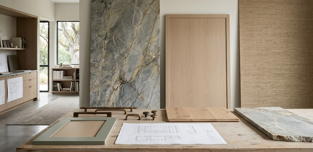
Do not arrange every sample as if it has equal importance. Represent the approximate hierarchy of the finished room.
If cabinetry dominates, use a large cabinetry sample. If stone covers the island and backsplash, show enough stone to understand its movement. If wallcovering occupies one small niche, it should not dominate the material board.
Scale the presentation conceptually. The board should help explain the room.
How Important Is Texture?
Texture can create depth without adding another color or pattern.
Imagine a palette of:
White oak cabinetry.
Creamy honed stone.
Warm plaster.
Woven wallcovering.
Aged bronze.
The colors may all be relatively restrained. But every surface interacts with light differently. Wood has grain. Stone has mineral depth. Wallcovering has fiber. Metal has reflection. Plaster has subtle variation.
The room feels layered because the materials are physically different.
What Happens When Everything Is Smooth?
The room may feel flatter than expected.
Painted cabinetry.
Polished stone.
Smooth painted walls.
Polished metal.
All can be beautiful, but they share a relatively similar visual smoothness. Adding one tactile element can change the composition:
Natural wood.
Honed stone.
Grasscloth.
Plaster.
Texture is often what makes a restrained palette feel rich.
What Happens When Everything Is Textured?
The opposite problem.
Reeded cabinetry.
Strong stone.
Woven walls.
Hammered hardware.
Heavy plaster.
Textured flooring.
Now every surface asks to be touched and noticed. Restraint still matters. Texture needs hierarchy too.
How Should Sheen Be Coordinated?
Think about reflection.
A polished countertop reflects more light. So does polished metal. High-gloss cabinetry adds another reflective plane. Metallic wallcovering can add another.
If all four are highly reflective, the room may become visually restless. Mixing sheen levels can create balance.
For example:
Matte cabinetry.
Honed stone.
Subtly textured wallcovering.
One brighter metal.
Now the hardware can provide the controlled reflection.
Can Polished Hardware Work With Honed Stone?
Very well. Contrast in sheen can make a small hardware detail feel intentional. Similarly, aged bronze can soften a polished stone.
The materials do not need identical surface treatments. Often, differences create the depth.
How Does Lighting Affect Material Coordination?
Light changes everything. Natural wood shifts throughout the day. Stone reveals different mineral characteristics. Metal reflects surrounding colors. Wallcovering can become dramatically lighter or darker depending on direction and texture.
A palette should be evaluated in:
Daylight.
Artificial ambient light.
Task lighting.
Integrated cabinetry lighting.
If possible, review major samples in the actual residence.
Why Is Directional Light Particularly Important for Wallcovering?
Because texture creates shadow. A woven wallcovering may look almost flat under frontal light. With light grazing across it, the texture becomes much more visible.
The same is true of plaster and certain stone finishes. Lighting should reveal materials. Not accidentally distort them.
How Does Architecture Affect the Palette?
Materials should follow architectural boundaries.
A cabinetry finish can change at a plaster opening. Wallcovering can terminate at built-ins. Stone can define an island. A metal detail can repeat across doors and lighting.
These transitions feel intentional because the architecture explains them. Random material changes are harder to justify.
Where Should Material Transitions Happen?
At meaningful edges:
Corners.
Openings.
Cabinet volumes.
Changes in ceiling height.
Separate rooms.
Furniture-like elements.
An architectural boundary gives the eye a reason for the material to change. This is particularly important in open-plan residences where several finishes may be visible at once.
How Do You Coordinate Materials Across an Open Floor Plan?
Begin with sightlines. Stand where the spaces overlap visually.
What cabinetry can you see from the living room?
Can the dining wallcovering be seen behind the kitchen island?
Does the bar introduce another stone?
Is there a fireplace in the same view?
Then edit. The materials do not need to match. But they should not compete across the same sightline.
Should the Kitchen and Bar Use the Same Cabinetry?
Not necessarily.
A white oak kitchen might connect beautifully to a walnut bar. The countertop could create continuity. Or hardware might repeat. Perhaps the same warm bronze appears in both.
One shared element can be enough. Connected spaces need relationships. Not duplication.
Can Wallcovering Help Connect Different Cabinet Finishes?
Yes.
Imagine a home office with walnut cabinetry adjacent to a space with painted built-ins. A wallcovering containing subtle warm brown and mineral gray can help connect both.
Again, the relationship should remain understated. The wallcovering is supporting the palette. Not explaining it literally.
How Many Major Materials Should One Room Have?
There is no correct number. But every material should earn its place.
If removing one finish makes the room clearer without making it less interesting, that material may not be necessary. A sophisticated room can be built from very few materials:
White oak.
Stone.
Plaster.
Bronze.
That may be enough. Another room may genuinely need wallcovering, painted cabinetry, multiple woods, and a second metal. Complexity is not the problem. Unnecessary complexity is.
How Do You Know When the Palette Is Too Busy?
Look for competition.
Does the eye move constantly without finding a place to rest?
Are several patterns similar in scale?
Are multiple materials trying to become the focal point?
Are there several unrelated colors?
Does every finish feel “special”?
If so, remove something. Quiet materials are not filler. They create the visual space that allows important materials to matter.
What If the Palette Feels Too Safe?
Then identify where one stronger move could help.
Perhaps the stone needs more movement. Perhaps the wallcovering needs deeper color. Perhaps the hardware needs greater contrast. Perhaps the island should become walnut rather than repeating the perimeter cabinetry.
Do not make everything stronger. Choose one area.
Should Every Material Repeat Somewhere Else?
No. Repetition can create continuity, but forcing every material to appear twice can make the design formulaic.
A dramatic stone may appear only on one island. That can make it more important. A wallcovering may exist only in the bar. A distinctive metal may be reserved for one furniture-like cabinet.
Some materials gain power through scarcity.
What Should Repeat?
Usually the quieter connective elements.
An undertone.
A hardware family.
A wood species.
A plaster color.
A subtle wallcovering color.
A stone temperature.
These repetitions create cohesion without obvious matching.
How Do You Coordinate Materials Across an Entire Residence?
Establish a broader material language before designing each room independently.
Perhaps the residence uses:
Warm natural woods.
Creamy mineral surfaces.
Muted earth-based paint colors.
Aged metals.
Textured walls.
Each room can then interpret that language differently. The kitchen may emphasize white oak and quartzite. The bar may emphasize walnut and wallcovering. The primary bathroom may use painted cabinetry and a quieter stone. The office may return to walnut.
The house feels connected without becoming repetitive.
Why Is Whole-Home Material Planning Especially Important for Cabinetry?
Because cabinetry appears in so many rooms:
Kitchen.
Bathrooms.
Wardrobes.
Laundry.
Mudroom.
Office.
Library.
Bar.
Media room.
If every cabinetry decision is made independently, the residence can quickly become fragmented. That does not mean every cabinet should match. It means the relationships should be established intentionally.
What Should You Bring to a Cabinetry and Material Review?
Bring the real project:
Architectural plans.
Cabinet elevations.
Large cabinetry samples.
Stone samples or slab photographs.
Flooring.
Hardware.
Wallcovering.
Paint.
Plaster references.
Appliance finishes.
Lighting information.
The goal is to see relationships. A cabinet sample alone cannot tell you whether the room works.
Should Materials Be Approved Separately?
Sometimes approvals happen at different stages. But major finishes should still be reviewed together before final decisions are locked.
A stone may need approval before hardware arrives. That is fine. But the hardware direction should already be understood. The process can be sequential. The design thinking should remain integrated.
Why Are Full-Scale Installations Useful?
Because proportion becomes real.
A cabinet door sample can show color and finish. It cannot fully communicate:
Reveal width.
Door scale.
Hardware proportion.
How stone sits against cabinetry.
How light moves across a tall elevation.
How an interior feels when several materials occupy large surfaces.
Full-scale cabinetry displays help bridge the gap between sample and room.
How Do You Make the Final Material Decision?
Stop asking whether each individual finish is beautiful. Instead ask:
Does the cabinetry establish the right architectural foundation?
Does the stone have the appropriate amount of movement?
Does the hardware create the right contrast?
Does the wallcovering add something the room does not already have?
Do the undertones cooperate?
Are the patterns balanced?
Are the sheen levels intentional?
Does the palette work in the actual light?
Does the room have a clear hierarchy?
And perhaps most importantly: Is there somewhere for the eye to rest?
How to Coordinate Cabinetry, Stone, Hardware & Wallcoverings
Begin with hierarchy. Choose the material that carries the strongest design idea. Then let the remaining materials respond.
Coordinate cabinetry and stone through undertone, movement, and scale. Use hardware to refine contrast and connect larger finishes. Treat wallcovering as a material rather than an afterthought. Control pattern. Vary texture. Balance sheen. Study sightlines. Make transitions at architectural boundaries. Review large samples.
And resist the idea that every selection needs to be extraordinary on its own. A sophisticated interior does not feel coordinated because everything matches. It feels coordinated because every material appears to understand its role.
The wood provides warmth. The stone introduces mineral character. The hardware defines the details. The wallcovering adds softness, pattern, or texture. And the architecture gives all four somewhere to belong.
Coordinate Your Material Palette With Atelier Design Society
Atelier Design Society works with homeowners, architects, interior designers, builders, and other design professionals developing premium cabinetry and material palettes for sophisticated Bay Area residences.
At the Atelier Design Society showroom in Menlo Park, project teams can compare cabinetry materials, natural woods, painted finishes, stone, hardware, wall treatments, and related architectural finishes while evaluating undertone, texture, movement, scale, and material hierarchy.
Bring project plans, cabinetry elevations, stone references, flooring, hardware, wallcovering samples, paint or plaster references, and other major finishes when available.
The goal is not to make every material match.
It is to make the entire room feel resolved.